
Metronode, a subsidiary of the Leighton Group wanted to re-brand their data management company. The circular symbol represents the data centre with cable like shapes converging in the centre. 2 colour logo in PMS 356C & PMS 647C. Branding and brochure design by Sabrena Ellison.
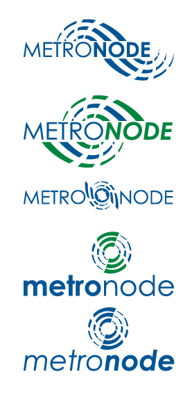
Initial concept development.
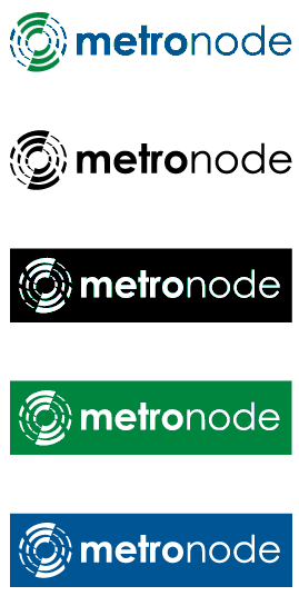
Final logotype in 2 colour, mono and reverse.
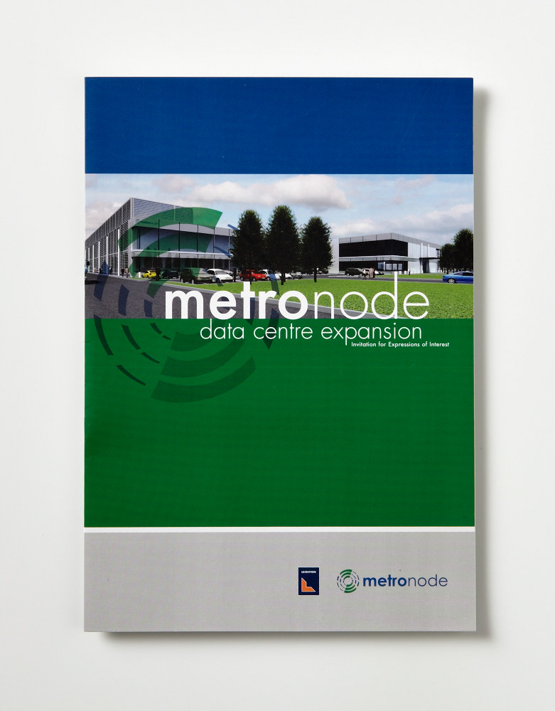
Metronode data centre launch brochure.
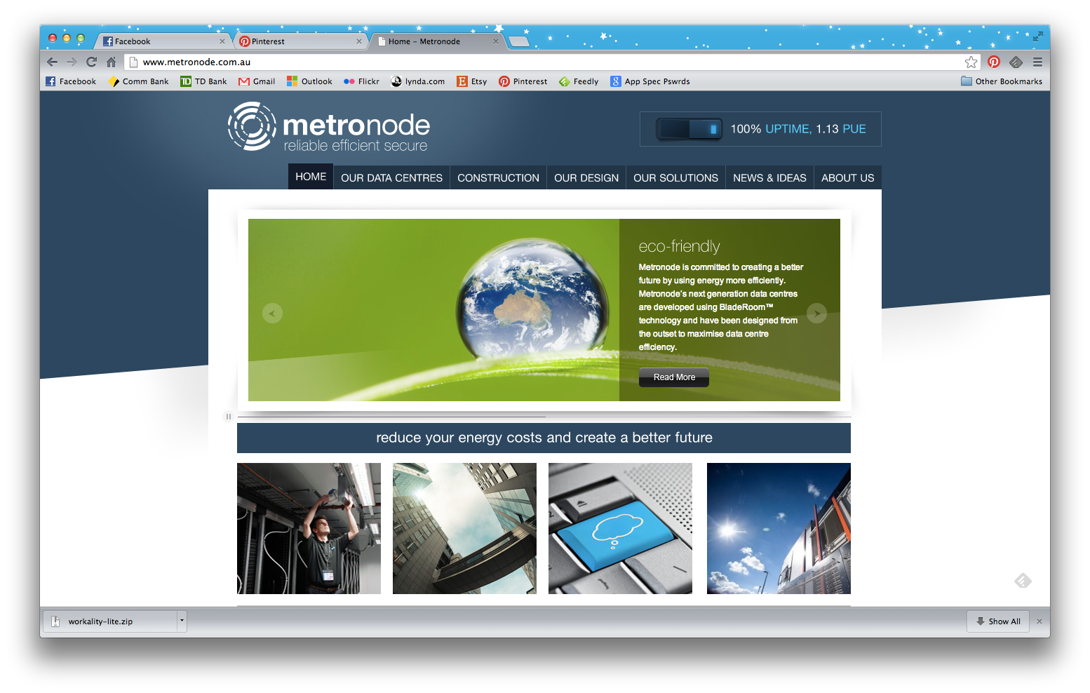
Metronode website (for logo integration example only)